
How 5 beauty salons have created a unique, consistent brand online

Salon branding is such a hot topic these days!
Back in the day, your brand pretty much came down to your logo and what color you paint your walls.
But now, with so much more competition in the beauty industry, and so many expectations for sharing a unique brand on social media, most beauty salons are stepping up their game.
They know that in order to attract clientele, they need to give an amazing first impression, then keep a consistent, polished look in everything they do - from their Instagram posts, to their websites, to their photography style.
This blog post will give you salon branding ideas based on 5 unique beauty businesses I’ve come across. These businesses have figured out the best color schemes, the best designs, and the best social media styles to create a stunning brand online.
My goal here isn’t for you to get ideas for how to copy them, but by the end I hope you’ll see what are the elements of a solid brand and how to create your own gorgeous visual identity.
Why branding should be at the top of your "to-do" list
A brand is how you express your salon’s personality visually, through your logo, colors, fonts, decor, and image style.
Each business is unique - with a different mood, energy, and people involved - and your brand needs to be unique too!
So, on one hand it’s a reflection of you, but on the other hand your brand attracts your ideal clients. When you create a brand that actually does an amazing job of “speaking” for you, it’s like the silent ambassador for your business.
So, what is my advice for deciding on the right brand for your salon?
Start by understanding your business personality
Then, choose a color scheme that is expressive
Finally, learn how to build a branding board so you’re always staying consistent
Once you’ve checked out those blog posts (they’re super juicy, with a ton of ideas!), get inspired by these 5 gorgeous salon brands!
Heyday skincare - Fresh, clean and minimal
Heyday is a facial skincare spa with several locations in New York City and Los Angeles.
Since they're focusing on skin health, it makes sense that they've created a brand that looks clean and fresh. However, they've also done a great job of expressing a friendly personality with bright, fun colors.
Let's take a look at how Heyday expresses their brand through their logo, colors, Instagram, and their in-store decor.
Their logo
The Heyday logo is simple in black and white. It's bold and modern, and almost looks like something you could wear on a pin or a T-shirt.
Tip: Your logo doesn't have to be over-complicated to make a statement. Sometimes simple is best, and can make a great first impression.
Their color palette

On their website, Heyday tends to stick to black, white, and this pretty minty/teal color. In keeping with the "less is more" theme, they know that mixing too many colors together can cause confusion.
Often the best way to have a strong brand is to stick to fewer colors and use them consistently.
Their Instagram theme

Heyday's Instagram feed is a constant inspiration! Once in a while they post photos of their clients and staff, but they mostly stick with simple, minimal photos on a simple colored background.
Heyday has created an Instagram style that's all their own by being consistent in the colors and styles of photography they post. Light bright photos with dominant colors (not too much going on in the photos) keeps their feed looking clean.
Their salon decor
Each of Heyday's locations has a unique decor, but all of them follow the same minimal, fresh look.
Blank walls, lush greens and tall ceilings keep the design modern but friendly.
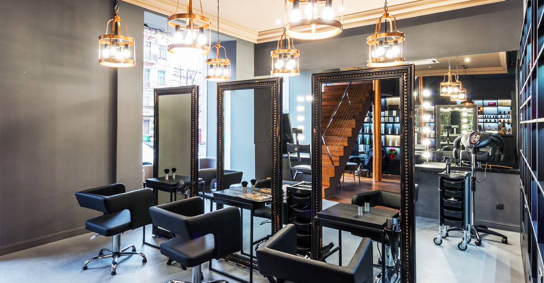
Her Majesty’s Pleasure beauty & cocktail bar - Vintage glamour
Her Majesty's Pleasure (amazing name, by the way!), is such a cool concept for a beauty salon. They've mixed a gorgeous cocktail bar with a fun beauty salon, with loads of style and charm.
I call HMP's visual brand "vintage glamour" mostly because of their photography style, which is so attractive and gives off a great vibe.
Their logo
Like Heyday, Her Majesty's Pleasure has opted for a simple logo that relies on a stylish font. You can't go wrong with black and white as it's so versatile.
This font is a classic serif font (it has those little ridges at the tops and bottoms of the letters) that looks vintage, but is also pretty stylish even now.
Their color palette

I love that Hmp shows off their color scheme right on their Instagram, within the Instagram stories highlights. While their colors are quite varied, they all have a muted, classic look to them.
Their Instagram theme

If you ever feel like your salon's Instagram is getting dull, pop on over to this one. Their photography game is strong! Whether it's photos of cocktails by the pool or just an amazing manicure, Her Majesty's Pleasure has worked hard at keeping a consistent image style.
All of these photos have a similar vintage filter used on them, with interested poses and strong shadows.
Tip: Photo filters don't have to be super strong, and they aren't the enemy! If you choose a mild photo filter (or turn down the strength) and use it consistently, it can turn a bunch of random photos into a beautiful catalogue of branded images!
Their salon decor
From their bar to their pedicure stations, Hmp keeps with a glamourous other-time feel. Just check out the rotary phones they have so their clients can literally "call for champagne"... how fun is that!
NAF Salon - Bright and retro
NAF is a funky nail salon in Glasglow, Scotland. They've not only won numerous awards and launched their own nail care products, they have an incredible visual brand. Like seriously, they live and breath style and I love it!
Their logo
NAF's brand starts with their logo and goes from there. Big, bold, fun and colorful, plus it has an exclamation mark!
I like that fact that they stayed away from "classically girly" fonts for their logo and went for a completely unique style.
Their color palette

The NAF website is not only gorgeous, it oozes style and loads of color. Their color scheme tends to be light pastels with some hits of retro neons. So in love with that!
Their Instagram theme

Is it just me, or is NAF using a light box and a ring light for their nail photos?? However they're doing it, their nail photos are always bright and shiny, with pops of color.
When you're taking photos for social media, try to keep in mind a consistent style - like colors, poses, background, or lighting. It will help in developing a unique Instagram theme.
Their salon decor

I think my favorite part of the NAF brand is how they've extended it into their actual salon decor. The velvet chairs, palm trees, pool-themed wallpaper... they all scream "retro cool"!
Tip: See if you can find some unique ways of making your brand shine through in your interior design, too. Whether it's a small section of colored wallpaper (in your brand colors, of course), a statement chair, or even just a decorated corner for selfies - your brand can be reflected inside your salon, too!
Olive & June nail salon - Pretty pastels
Olive & June has been called one of the prettiest nail salons in the country, and it's no surprise! Their salon decor is feminine, pretty and floral. And that prettiness extends into their visual brand as well.
Their logo
Font-based logos (as opposed to logos that are built around a symbol or illustration) are very popular right now. In fact, all the logos on this list so far are simple and font-based.
Notice how this logo takes two short words and crafts them together with the & sign. It's so pretty and elegant!
Their color palette

Bubblegum, lilac, blush, and white. Olive & June stick with a feminine pastel color scheme, represented by lots of different colors on their website and social media. It feels simple and not at all childish, however.
Tip: Try to pick a color palette that will attract your favourite kind of clientele. Oftentimes these are people with similar likes and dislikes as you have. What are some of your favorite colors? Can you sneak these into your palette?
Their Instagram theme

This nail salon takes their imagery seriously. It looks like they mix in everyday salon photos with professional photoshoot shots, particularly on a simple pastel-colored background. Adorable!
Their salon decor
Keeping with their pink and white/ pastel theme, the Olive & June salon seems so captivating from the street!
They even have quaint wicker chairs with pink and white pillows, while massive windows let you peak into what looks like a relaxing paradise.
Blushington makeup lounge - Peachy keen
Blushington is a makeup and beauty lounge with 6 locations in the US. They've been extremely intentional about making a brand that matches everywhere, particularly based on a lovely peachy hue!
Their logo
I am so in love with the Blushington logo! It's cute, simple, and elegant, with a ribbon symbolizing a B, plus the word written below.
Tip: It's great to have two variations of your logo. One can be a longer, thinner word mark like the word Blushington. The other can be more of a symbol or a single letter, which is perfect for your Instagram or Facebook profile pic.
Their color palette

The Blushington color palette can be defined as: peach, peach, and more peach!
They've build most of their brand around their color palette, and it's an incredibly strong brand. From their website to their social media, peach is everywhere!
Their Instagram theme

Even in their Instagram posts, this salon has found a way to sneak in peach objects and highlights. Part of creating a consistent brand is having a consistent social media presence. And one of the easiest ways to do that is to incorporate your main brand colors into your photos!
Their salon decor
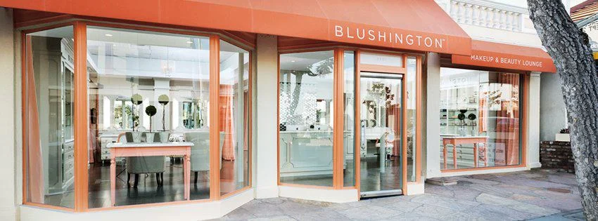
Who wouldn't love a salon space like this? Matching painted frames, window coverings, and furniture, all with a signature branded color.
Absolutely gorgeous!
In conclusion
Your salon brand is absolutely something you need to think about often. First, make sure that you've created a visual identity that expresses your business personality, and then constantly check that you're staying "on-brand" in everything you do.
From your website colors, to your social media images, and even your salon decor, the more unique your brand is, the more you use it consistently, the more you'll attract the right kind of client to you. And you'll stand out while doing it!
Before you go! If you want to grow your brand recognition and following on Instagram (who doesn’t??)… I’ve got a new FREE masterclass to share with you!
This free training is full of juicy ideas for your salon’s Instagram, from using the right hashtags, to creating a beautiful portfolio of your work, and everything in between.
Sign up for my next session here! See you on the training :)


