
How to pick the best colors ever for your salon brand

If you already have a color palette for your business and it’s perfect, this probably isn't the blog post for you. But if you're like many salon owners, my guess is that you broadly fall into one of these two camps:
Many of the salon owners I talk with have been using the same colors over and over but they feel no strong connection to them. Their colors mean nothing, or they're tired and “out of date”.
Other salon owners I see change their colors with the weather. If they’re feeling pink, they go pink. If they think green looks better, they go green.
And they're flip floppy like this everywhere, although these clashing colors stand out the most on social media.
Here's what I'd like to start out with: Color matters. What color you choose to represent your salon matters.
If you’re being flip floppy about your colors, your clients will never have that “magic” moment where they see a color and they immediately associate it with you.
If you stick with your standard colors but they aren’t meaningful, they aren't expressive of who you are, or maybe they clash… it’s just as bad. Because you’re doing your salon a disservice.
So I want you to promise me something. That you’re going to take the next several minutes to meditate on your colors, to commit to creating a color palette that kicks ass, and then promise to actually use it consistently wherever you publish or post things for your salon.
Let’s get this out of the way first: Colors do matter. A lot.
If you think of some of the biggest names in the beauty industry, I can probably pinpoint something they've done extremely well:
They've gotten to the point where you recognize them based solely on their colors.
Check out these famous beauty brands that I'm sure you're familiar with:
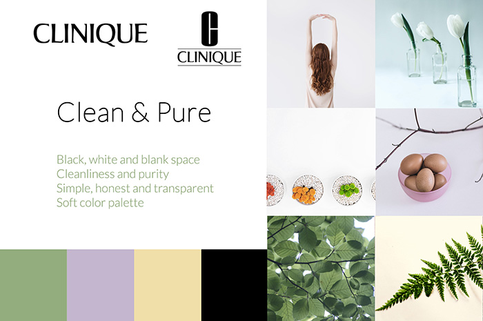

What are some of the things you notice about these brands?
First, you’ll probably notice that their color palettes were instantly recognizable to you, even if you didn’t realize it before.
These companies have used their colors so consistently - everywhere you can find them - that we’ve come to associate these colors with the brand.
Second, you’ll probably notice that the image styles and general design theme relate back to their color palettes.
Take Moroccan Oil for example, whose brand is all about beachy luxury. In fact, their colors are aquamarine and gold.
They’ve been really clever in formulating their whole brand around this theme and it’s in everything they do.
These big companies pay consultations hundreds of thousands of dollars to create these brands.
But you don’t have to do that with your beauty business.
This blog post will show you step by step how to design a gorgeous color palette. But more than a process of picking really great colors, the most important thing we'll see is how to base your colors around your salon personality (link) and what’s important to you in order to create a truly authentic brand.
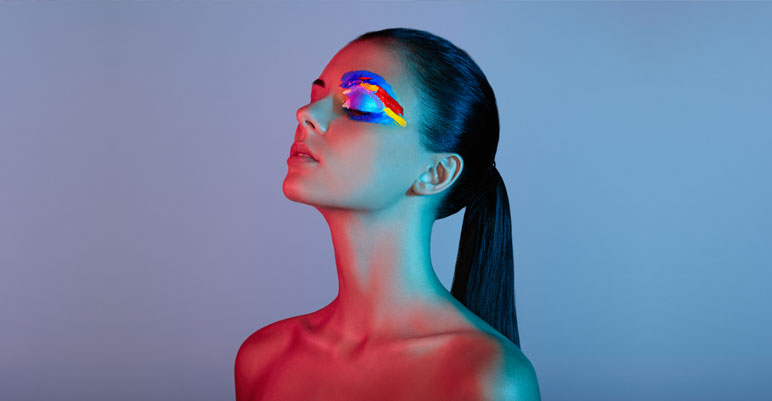
Why color actually makes all the difference for your beauty brand

Choosing the right color can make a huge difference to your beauty business. In fact, 85% of people say that color is the primary factor in their purchasing decisions (source)
While that seems crazy, it actually makes a lot of sense. When people are looking at two products (or salons) that they don’t know much about, but which seem pretty similar, they have to make a superficial decision. They have to decide which one to choose based on some gut instincts.
And it turns out that our guts react very strongly to colors.
Color goes wayyy back to human evolution and what helped us to survive long before we knew what a “branding board” was.
We developed super strong connections (good or bad) to certain colors because we associated them with certain objects.
Blood red might alert us to nearby danger, while a deep brown might signal dirt or rotten food and make us feel icky (source)
The myth about “what colors mean”
Fortunately, we’ve evolved enough as a species to know that brown things can actually be delicious (hello brownies and coffee!) and that all red things aren’t a sign of blood.
But, I made my point before to show that our brains are made to make connections between colors and meaning.
To relate it back to your salon, it’s just a matter of finding the right colors with the right meaning for you and your clients.
The truth is that you shouldn’t try to fit a color into your palette just because you have a spa and someone says that yellow is calming.
Instead, it’s important to look at yourself first and foremost. This is the very first step for building an amazing color palette.
STEP 1: The most important thing ever... choose colors that are meaningful

I talk a lot about branding and salon personality in my other blog posts.
That’s because at the base of every successful brand is something that’s not "copyable". It’s completely authentic. And it never goes out of style:
A genuine personality.
So as we’re going through these exercises and ideas, keep this in mind: the more “authentic you” you can infuse into your colors, the better.
Whether that’s choosing colors that you love, colors that your target audience identifies with, colors that represent a part of your story or history, or colors that speak to where you’re from or where you’re going…
When you put part of your heart and soul into your colors, they stick around. They’ll still be important and meaningful 10 years from now even when design trends change.
And best of all, everytime you look at your palette it’ll speak directly to you.
So before you go anywhere else, think hard about your salon personality and target market. You can read my blog post all about that here.
STEP 2: Pick two main colors to start with
At the end of this exercise you’re going to build a gorgeous color palette for your salon.
Most color palettes consist of 4 or 5 colors that look great when used together.
But before building a full color palette, we want to start with 2 main colors that you’ll base the rest of your palette around.
Again, try not to rely on the color “stereotypes” we’ve all heard. For example, purple is not necessarily a “royal” color. It depends completely what kind of company is using it, what type of purple it is, or what other colors its paired with.
In short, feel free to choose the colors that you want. And the easiest thing to do is start with two main ones.
Here are some ideas to get your color connections running.
For each of these ideas, mentally jot down a few of the first colors that come to mind. Or better yet, write it down.
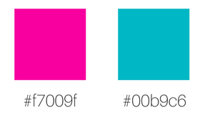
Choose colors that reflect your name or values.
For example, an organic beauty brand having green and brown makes sense. Or for Sunnystorm Marketing, I could have chosen a sunny color like warm yellow, and a stormy color like deep purple.
I didn’t end up choosing this color combo, but I definitely considered something like this.
Choose colors that reflect your salon’s personality.
This is my favourite way to choose colors, and it can definitely used in conjunction with some of these other ideas.
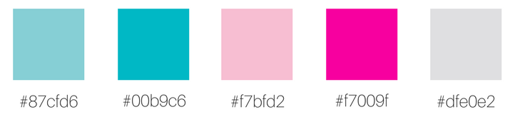
For example, for this pretend brand I did, I started with two colors that present the personality of youth, fun, excitement, and celebration:
And then from there, I created a palette that stems from those two colors:
Choose colors that stand out from competitors.
For example, if all of your competitors are going for white, light pink and beige, why not choose a bright bold color?
Choose colors that complement your existing color.
If you’ve already got a logo and a business, chances are you’ve already got a primary color. If you’d like to stick with it, why not choose a second color that complements it? More on how to do that later.
Choose colors that your clients or target audience identify with.
As you saw in the palettes from beauty brands above, different colors do help different people identify with you.
If you’ve figured out exactly who your target audience is, it’s a lot easier to pick out colors that they’ll identify with and be attracted to.
See how to do that here: Branding for salons: How to define your salon personality to create a platinum brand
STEP 3: Use these super easy tools to put together a palette based around your two main colors
I hope you've already been brainstorming some gorgeous color ideas. Now, time to take some of those ideas and see how they can translate into a beautiful palette.
There are some great sites that can help you easily build your color palette.
One thing to be aware of with all of these tools is something called a Hex Code.
A Hex Code is a 6 digit code that uniquely identifies a color among the millions of others. You use this code to reuse colors once you find the ones you like, no matter where you are or which software you’re using.
My ultimate color palette finder: Coolors
This is one of my favorite ways to choose a palette.
Here are three ways to use this awesome app:
1) Press the space bar until you get a cool color combination and save it to a Pinterest inspiration board.
2) Press space bar until you find a color you like, lock it by clicking the lock and then continue to press the space bar until you get a nice palette.
3) If you already have one or two brand colors, place them in with their hex codes, then press the space bar until you find the right palette.
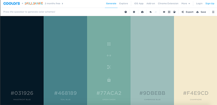
Find colors that look great together, according to color math: Adobe Color Wheel

The Adobe Color Wheel has this amazing function where you start with a color and then it creates a palette for you based on the math or science of which colors go together.
For example, in the screenshot above I started with a dusty rose color, and chose a “monocromatic” color scheme. That means that the palette consists of different shades or hues of pink.
Otherwise, I could start with the same color but choose “triad”, which means the color wheel finds colors on three opposite sides, like this:

Get inspired with the most beautiful color palettes from photos: Design Seeds

If you’re a visual person and you love looking at pretty things, this website will give you some powerful inspiration for your palette.
If you have a specific color (or colors) that you’re starting with, try looking at palettes with those shades here: search Design Seeds by color
What your colors DO say about you
As I mentioned before, it’s useless to try and make a palette based about the stereotypes behind colors. I've read in many places that orange represents value and simplicity… ummm not exactly.
However, there is some research about colors that I do believe will help you.
It turns out that it’s not exactly the colors but the types of tones that you choose that could mean different things for your brand.
Let's say you've chosen purple and yellow as your main colors.
You could look at different types of purple and yellow, along with complementary colors, and you might be portraying entirely different moods:
Light, bright, pale = energetic, friendly, open:

Dark, saturated = intense, corporate, serious:

Bright, intense = high energy, powerful:

Pure = child-like, unaffected, trustworthy:

Grayed-down = low-key, neutral, non-threatening:

See how that works? The first two colors are always purple and yellow, but completely different types. Plus they’re paired with color palettes that are muted, or intense, or dark.
It's clear that the types of colors you choose matter so much more than simply “purple” or “yellow”.
See how I chose color schemes for these (pretend, but awesome) beauty brands
Let's play a little game to finish things off.
First I'm going to show you a color palette and you make a mental note about what you think the “brand” behind the color palette might be.
Then scroll down and see what that brand is.
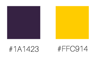
Oh, do you see those codes underneath the colors? Those are their Hex Codes.
It’s a unique identifier used to distinguish your color among the millions of them out there.
Any software or app where you need to choose colors will most likely ask your HEX code. So make sure you make note of the HEX code for your colors!
What do these colors make you think of?
For me, I think of warmth, femininity, maturity, and grace.
In fact, this is the color palette I chose for my pretend spray tan business, Empress and Co:

Here’s a hint for you: Choose colors that your target market identifies with.
This sunless tanning brand (remember, it’s pretend) has a target clientele of middle-aged women aged 40-55. They’re upper middle class and are quite elegant and care for their bodies.
I chose the color palette primarily based on these qualities.
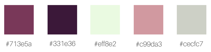
And how about this palette that is COMPLETELY opposite:
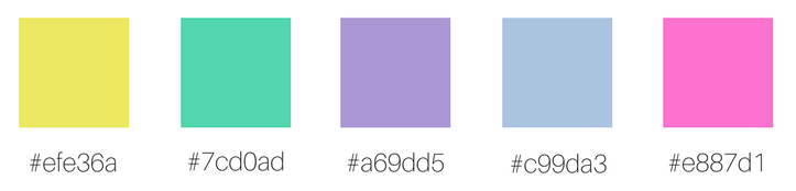
These are some fun colors, guys. They remind me of painting, childhood, candy, and toys.
They belong to a pretend hair salon I invented called Dye Hard (ha ha). I wanted to create brand that exudes lust for life and youthfulness:
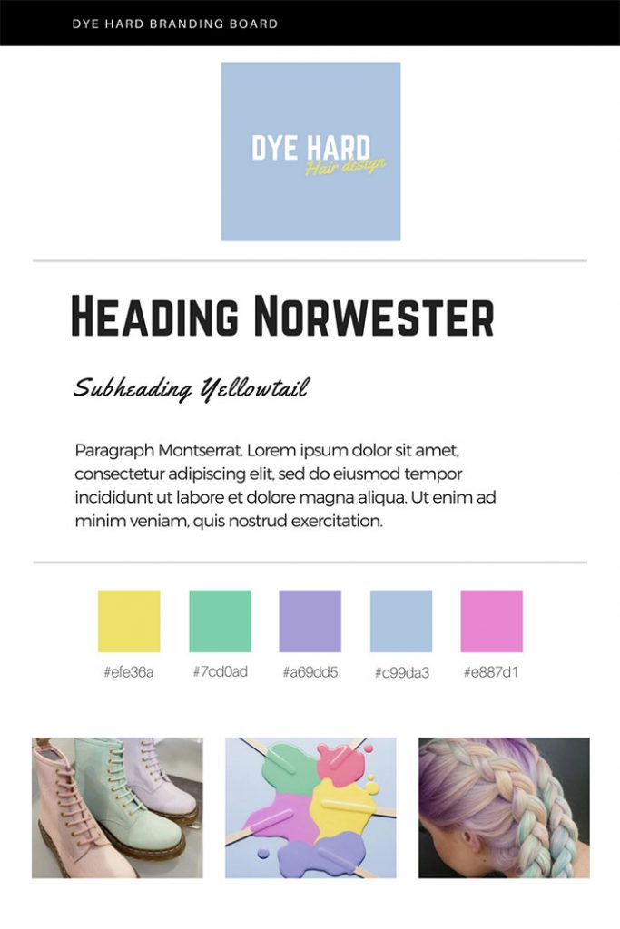
Here’s another hint for choosing a color palette: Think of an object that relates to your personality or target market. In this case I was thinking of toys and candy.
What are some colors that represent those things? Can you build up a color scheme around them?
Okay last one.
I love this color palette so much, that I kind of wish it was my brand:
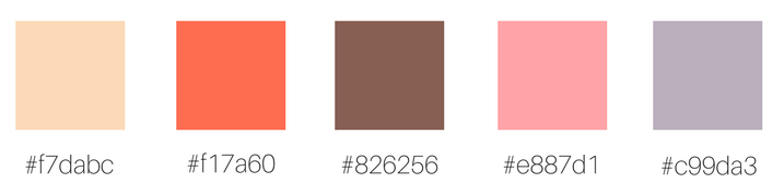
What do these colors make you think of?
To me they're warm, relaxed, beachy, and soothing.
In fact, I chose these colors specifically to go with a beachy themed facial spa (that I invented) called Fresh Faces:

I actually had the beach “theme” already in mind, so I found a gorgeous picture of a beach and then pulled the colors from it to create my palette.
Here’s one last idea: Find the most inspiring picture possible to represent your “theme”, or your personality. Then use a tool like Canva’s color palette generator to create a palette from it.
In conclusion
As you can see, colors have sooo much meaning and there are so many different ways to choose a palette.
But once you have a color scheme for your salon that is both beautiful and meaningful, you will never grow tired of it. In fact, the more you use it, the more you (and your fans) will fall in love with it.
Hope to see you there! (Click here to sign up for the next training)


